In this notebook, we will briefly review some of the key concepts of linear unsupervised learning, including Principal Component Analysis (PCA) and the effects of regularizations on linear decompositions, such as SparsePCA and Non-negative Matrix Factorization (NMF). We will use a set of airfoil geometries to demonstrate these effects visually. For those who need to refresh their memory on basic concepts around Matrices and how they affect data, you can see visual examples in Appendix C
Learning Objectives
By the end of this chapter, you should be able to:
Explain PCA as a variance-maximizing orthogonal projection and read component and explained-variance plots.
Reconstruct data from k components and relate k to reconstruction error.
Contrast PCA, Sparse PCA, Dictionary Learning and NMF by their constraints, interpretability and cost.
Interpret decomposition components physically as airfoil shape modes.
Evaluate a decomposition on held-out data rather than on the training set.
Code
import numpy as npimport ipywidgets as widgetsimport requestsimport iofrom matplotlib import pyplot as pltfrom matplotlib.colors import TwoSlopeNorm# Download the airfoil dataset from GitHuburl ="https://github.com/IDEALLab/ML4ME_Textbook/raw/main/part1/airfoil_interp_uniform.npy"# Download the data fileresponse = requests.get(url)response.raise_for_status() # raise an error if download failed# Load into numpy arrayX_airfoils = np.load(io.BytesIO(response.content))
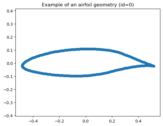
First, let’s load some airfoil geometry coordinates, take a look at the shape of the data matrix, and pick a random one to visualize:
Code
# Reshape the matrix so that it is N by D# where D is the X and Y coordinates concantinated togetherdef make_matrix(X): return np.reshape(X, (X.shape[0], -1))def make_airfoils(X): return X.reshape((X.shape[0], -1, 2))def make_airfoil(X): return X.reshape((-1, 2))# Centering the airfoils: subtract the mean x and the mean y over the whole dataset.# We keep the two means so that new airfoils can be centered the same way later.coordinate_means = X_airfoils.mean(axis=(0, 1))X_airfoils = X_airfoils - coordinate_meansprint(f"The shape of the airfoil dataset is {X_airfoils.shape}")# Split into training and held-out data: the first 80% of the airfoils are used to fit# every model in this chapter; the remaining 20% are never fit on, so that later we can# check how the fitted models behave on shapes they have not seen.train_fraction =0.8N = X_airfoils.shape[0]split =int(N*train_fraction)X_train = X_airfoils[:split]X_test = X_airfoils[split:]#### You can select a different Airfoil here if you want:airfoil_id =0#####################plt.figure()plt.scatter(X_airfoils[airfoil_id,:,0], X_airfoils[airfoil_id,:,1])plt.axis('equal')plt.title(f"Example of an airfoil geometry (id={airfoil_id})")plt.show()
The shape of the airfoil dataset is (1528, 192, 2)
Great, as we can see there are 1528 airfoils, expressed as 192 surface coordinates each with an x and y value. We can turn this into a matrix compatible with a linear decomposition by flattening the last two dimensions, so that each airfoil is a row vector of length 384 (2x192). We keep the first 1222 airfoils for fitting and hold out the remaining 306, which no model in this chapter gets to see; the exercises at the end use them to check how well the fitted decompositions generalize.
X_train = make_matrix(X_train)X_test = make_matrix(X_test)print("Training Matrix Shape:",X_train.shape)print("Held-out Matrix Shape:",X_test.shape)data = X_train# Transform back to original shape for plotting# That is, make it back to N by 192 by 2airfoils = make_airfoils(X_train)print("Airfoils Data Shape:",airfoils.shape)plt.figure()plt.scatter(airfoils[airfoil_id,:,0], airfoils[airfoil_id,:,1])plt.axis('equal')plt.show()
Training Matrix Shape: (1222, 384)
Held-out Matrix Shape: (306, 384)
Airfoils Data Shape: (1222, 192, 2)
Now let’s demonstrate how to use various dimension reduction algorithms on this example.
4.1 Principal Component Analysis
Mathematically, given centered data \(X \in \mathbb{R}^{n \times d}\), PCA finds k orthonormal components that best reconstruct the data in least-squares sense. One convenient formulation is
\[
\min_{W,Z}\;\|X - Z W\|_{F}^{2}\quad\text{s.t. }Z=XW^{T},\;W W^{T}=I.
\]
Equivalently PCA maximizes the projected variance:
There is no explicit L1/L2 penalty in vanilla PCA; the constraint \(W W^{T}=I\) enforces orthonormality of components.
The analytical solution is given by the top-k eigenvectors of the covariance (or the top-k left/right singular vectors from SVD).
from sklearn import decomposition# We can set the maximum number of components that we want to truncate to# Or can just leave it as None to get all componentsn_components =20# svd_solver='full' computes the exact SVD; the default (randomized) solver gives slightly different numbers on every runestimator = decomposition.PCA(n_components=n_components, svd_solver='full')Z_pca = estimator.fit_transform(data)components_ = estimator.components_
We see that we now possess a matrix (i.e., linear operator) that goes from the target 20 components/dimensions back to the original 384 dimensions.
print(f"The shape of the components_ matrix (W) is {components_.shape}")
The shape of the components_ matrix (W) is (20, 384)
If we wanted to visualize how each of these components looks like in terms of the original airfoil coordinates, we can reshape each row of the components matrix back to the original airfoil shape:
components_.reshape((n_components, -1, 2)).shape
(20, 192, 2)
Let’s go ahead and visualize the first all of the learned components:
Code
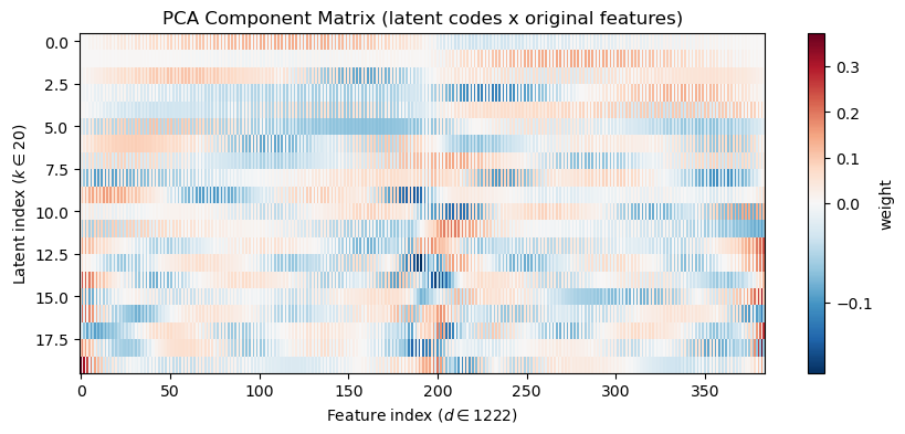
# Component heatmapplt.figure(figsize=(10,4))plt.imshow(components_, aspect='auto', cmap='RdBu_r', interpolation='nearest', norm=TwoSlopeNorm(vmin=components_.min(), vcenter=0, vmax=components_.max()))plt.colorbar(label='weight')plt.xlabel(f"Feature index ($d \\in {components_.shape[1]}$)")plt.ylabel(f"Latent index ($k \\in {Z_pca.shape[1]}$)")plt.title('PCA Component Matrix (latent codes x original features)')plt.show()
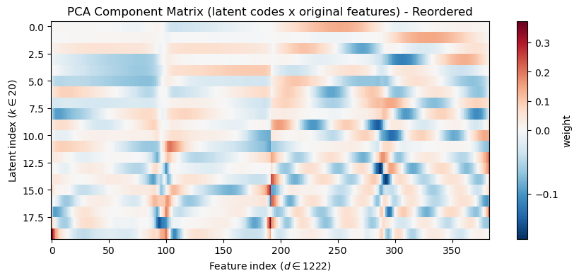
We notice a kind of alternating aliasing pattern in the components, but recall, this is because of how we reshaped the original data, which had rows of x and y coordinates interleaved. To make this clearer, we can visually re-order the indices of the components so that all the x-coordinates come first (first 192 features), followed by all the y-coordinates (second 192 features):
Code
# make an array with all of the odd indices of components_def reorder_indices(components):return np.hstack([components[:,0:-1:2],components[:,1:-1:2]])# Component heatmapplt.figure(figsize=(10,4))plt.imshow(reorder_indices(components_), aspect='auto', cmap='RdBu_r', interpolation='nearest', norm=TwoSlopeNorm(vmin=components_.min(), vcenter=0, vmax=components_.max()))plt.colorbar(label='weight')plt.xlabel(f"Feature index ($d \\in {components_.shape[1]}$)")plt.ylabel(f"Latent index ($k \\in {Z_pca.shape[1]}$)")plt.title('PCA Component Matrix (latent codes x original features) - Reordered')plt.show()
OK, this now looks a little clearer. What do you notice?
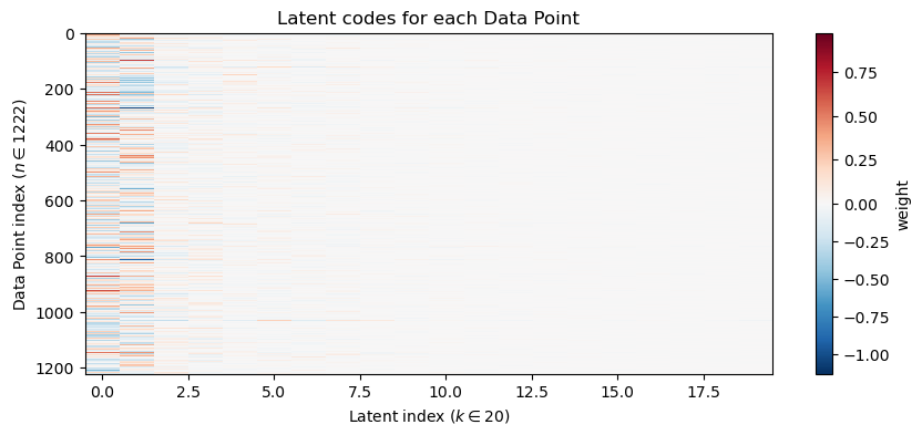
We can next visualize how each data point is mapped to all of the latent coordinates:
Code
# Latent Coordinate heatmapplt.figure(figsize=(10,4))plt.imshow(Z_pca, aspect='auto', cmap='RdBu_r', interpolation='nearest', norm=TwoSlopeNorm(vmin=Z_pca.min(), vcenter=0, vmax=Z_pca.max()))plt.colorbar(label='weight')plt.xlabel(f"Latent index ($k \\in {Z_pca.shape[1]}$)")plt.ylabel(f"Data Point index ($n \\in {Z_pca.shape[0]}$)")plt.title('Latent codes for each Data Point')plt.show()
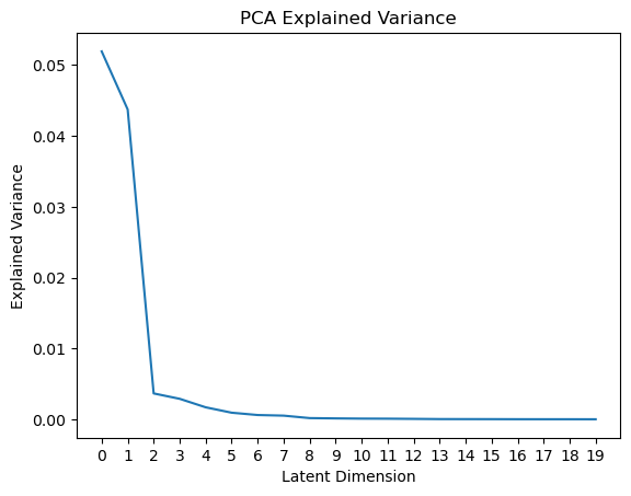
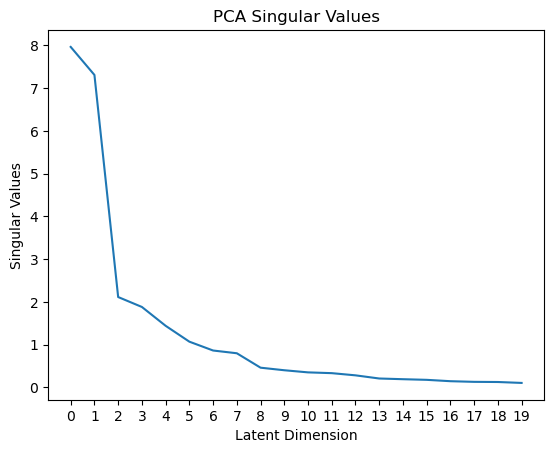
Why do you think the first few components are more important than the later ones? We can gain some intuition here by looking at the amount of variance explained by each component:
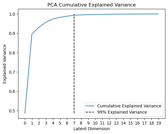
We can also visualize the cumulative explained variance to see how many components are needed to explain a certain amount of variance in the data. For example, we can plot a line at the number of dimensions we need to keep to explain 99% of the variance:
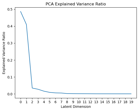
Or plot the explained variance ratio as a function of the number of components, which tells us how much each additional component contributes to the total explained variance:
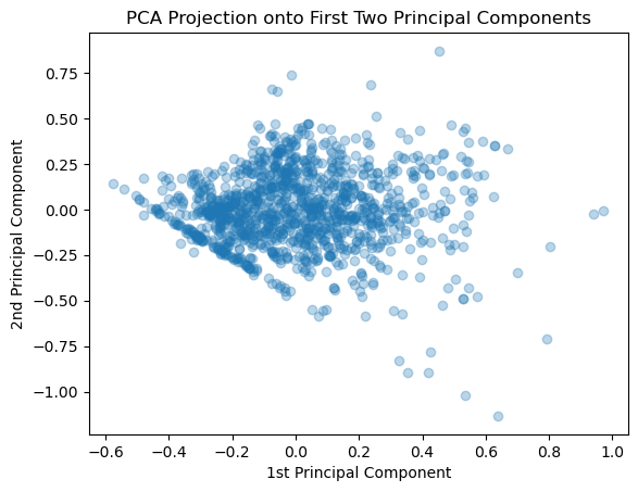
Moving beyond just the singular values, we can also now look at the projection of each airfoil into any of the latent dimensions. It is natural to explore the first two, since those explain the largest variance:
Code
z = estimator.transform(data)plt.figure()plt.scatter(z[:,0],z[:,1],alpha=0.3)plt.xlabel("1st Principal Component")plt.ylabel("2nd Principal Component") plt.title("PCA Projection onto First Two Principal Components")plt.show()
We can also pull out the “latent code/coordinates/vector” for an individual airfoil:
4.1.1 How does the # Components affect the Airfoil Reconstruction?
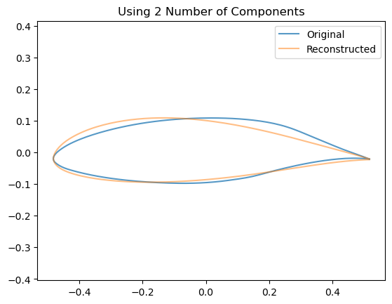
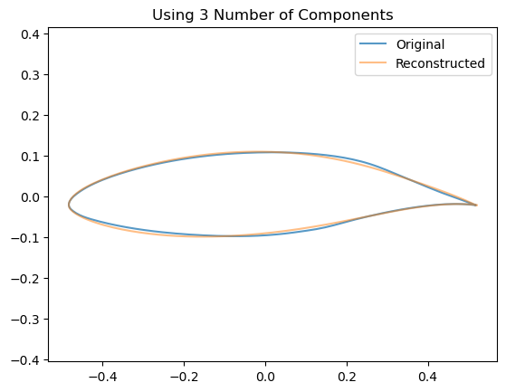
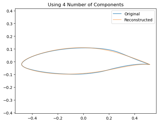
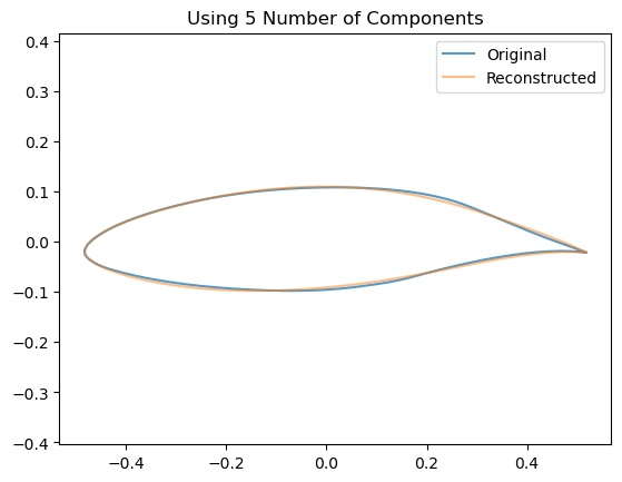
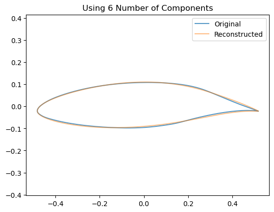
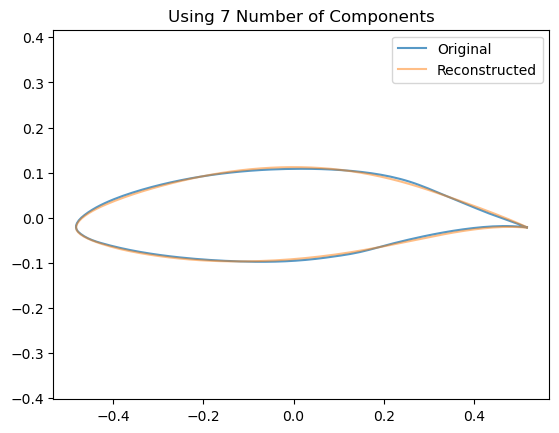
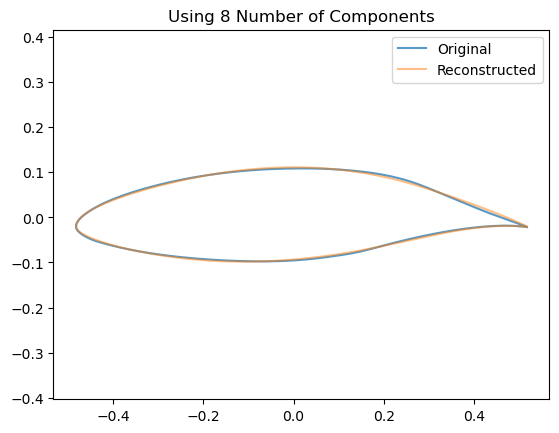
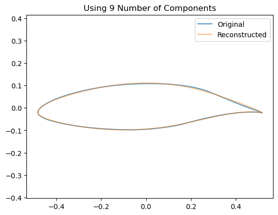
We can see visually the effect of including an increasing number of components by looking at how this affects the reconstruction of a single airfoil:
Code
for k inrange(2,10): pca_k = decomposition.PCA(n_components=k, whiten=False)# Train the model pca_k.fit(data)# Project down to the low dimensional space z_k = np.dot(data - pca_k.mean_, pca_k.components_.T)# Re-Project back to the high dimensional space x_hat = np.dot(z_k[0], pca_k.components_) + pca_k.mean_# Now plot them airfoil_original = make_airfoil(data[0]) airfoil_reconstructed = make_airfoil(x_hat) airfoil_mean = make_airfoil(pca_k.mean_) plt.figure() plt.plot(airfoil_original[:,0], airfoil_original[:,1], alpha=0.75, label ='Original') plt.plot(airfoil_reconstructed[:,0], airfoil_reconstructed[:,1], alpha=0.5, label='Reconstructed') plt.title(f"Using {k} Number of Components") plt.legend() plt.axis('equal') plt.show()
Code
# Interactive top-k overlay for contributionif widgets isnotNone: top_k_slider = widgets.IntSlider(value=1, min=1, max=9, step=1, description='top_k')def show_topk(k=4):# Find the first k principal components and multiply them with the corresponding latent variables contrib = np.dot(z[airfoil_id,:k], components_[:k,:])+ estimator.mean_ plt.figure(figsize=(6,3)) plt.plot(make_airfoil(data[airfoil_id])[:,0], make_airfoil(data[airfoil_id])[:,1], label='Original', alpha=0.6) plt.plot(make_airfoil(contrib)[:,0], make_airfoil(contrib)[:,1], label='Top-k contribution', color='C3') plt.plot(make_airfoil(data.mean(axis=0))[:,0], make_airfoil(data.mean(axis=0))[:,1], '-', color='g', label='Mean') plt.axis('equal') plt.title(f'Top-{k} component contributions (overlay)') plt.legend() plt.show() display(widgets.VBox([top_k_slider, widgets.interactive_output(show_topk, {'k': top_k_slider})]))else:print('ipywidgets not available; call the top-k overlay code manually.')
Code
# Interactive visualization of each componentif widgets isnotNone: component_selector = widgets.IntSlider(value=1, min=1, max=n_components, step=1, description='component')def show_component(k=4):# Find the first k principal components and multiply them with the corresponding latent variables#contrib = np.dot(z[airfoil_id,:k], components_[:k,:])+ estimator.mean_ plt.figure(figsize=(6,5)) selected_component = components_[k-1,:]+ estimator.mean_ plt.plot(make_airfoil(selected_component)[:,0], make_airfoil(selected_component)[:,1], label='Component', alpha=1.0) plt.axis('equal') plt.title(f'Component {k}') plt.xlim(-0.6,0.6) plt.show() display(widgets.VBox([component_selector, widgets.interactive_output(show_component, {'k': component_selector})]))else:print('ipywidgets not available; call the top-k overlay code manually.')
4.2 Sparse PCA
Sparse PCA encourages components that have many zeros, which can make the learned components easier to interpret as localized shape features. Below we fit a SparsePCA model and visualize a small set of sparse components and their effect on reconstructing an example airfoil.
Mathematically, Sparse PCA augments a PCA-style reconstruction loss with an L1 penalty on the (unconstrained) components to encourage sparsity. A common optimization is:
where \(W \in \mathbb{R}^{k \times d}\) holds the component vectors (rows), \(Z \in \mathbb{R}^{n \times k}\) are the codes, and \(\alpha>0\) controls sparsity. Different implementations (e.g., the sklearn SparsePCA) solve related objectives (sometimes using a LASSO subproblem or elastic-net style updates).
Notes:
The L1 term on W encourages many component weights to be exactly zero, producing localized/part-like components.
In practice one often also adds a small L2 (ridge) term to stabilize optimization (an elastic-net variant).
from sklearn.decomposition import SparsePCA#### Try Changing both n_components and alpha ########n_components =12# Warning: setting alpha too low will take the algorithm a long time to convergealpha =0.01##########################spca = SparsePCA(n_components=n_components, alpha=alpha, random_state=42)# fit on the flattened data matrix 'data' used abovespca.fit(data)W_sp = spca.components_Z_sp = spca.transform(data)
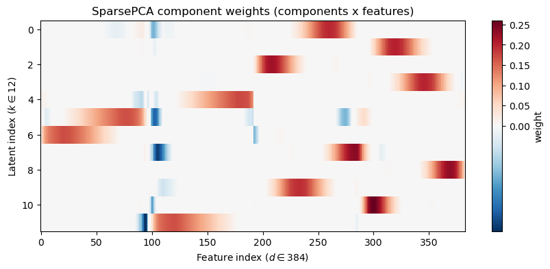
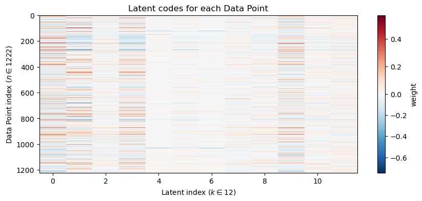
Now let’s take a look at what the Sparse PCA model has learned and how it reconstructs the example airfoil differently than vanilla PCA:
Code
# Component heatmap (components x features)plt.figure(figsize=(10,4))plt.imshow(reorder_indices(W_sp), aspect='auto', cmap='RdBu_r', interpolation='nearest', norm=TwoSlopeNorm(vmin=W_sp.min(), vcenter=0, vmax=W_sp.max()))plt.colorbar(label='weight')plt.ylabel(f"Latent index ($k \\in {W_sp.shape[0]}$)")plt.xlabel(f"Feature index ($d \\in {W_sp.shape[1]}$)")plt.title('SparsePCA component weights (components x features)')plt.show()# Latent Coordinate heatmapplt.figure(figsize=(10,4))plt.imshow(Z_sp, aspect='auto', cmap='RdBu_r', interpolation='nearest', norm=TwoSlopeNorm(vmin=Z_sp.min(), vcenter=0, vmax=Z_sp.max()))plt.colorbar(label='weight')plt.xlabel(f"Latent index ($k \\in {Z_sp.shape[1]}$)")plt.ylabel(f"Data Point index ($n \\in {Z_sp.shape[0]}$)")plt.title('Latent codes for each Data Point')plt.show()# Now let's try reconstructing an airfoil from the trained model# Pull out the latent representation of this airfoil IDz_sp = Z_sp[airfoil_id]x_hat = spca.inverse_transform(z_sp.reshape(-1, 1).T)# Alternatively, we could do the following manual reconstruction:#x_hat = np.dot(z_sp, W_sp) + data.mean(axis=0)# Interactive visualization of each componentif widgets isnotNone: component_selector = widgets.IntSlider(value=1, min=1, max=n_components, step=1, description='component')def show_component(k=4):# Find the first k principal components and multiply them with the corresponding latent variables#contrib = np.dot(z[airfoil_id,:k], components_[:k,:])+ estimator.mean_ plt.figure(figsize=(6,5)) selected_component = W_sp[k-1,:] + data.mean(axis=0) plt.plot(make_airfoil(selected_component)[:,0], make_airfoil(selected_component)[:,1], label='Component', alpha=1.0) plt.axis('equal') plt.title(f'Component {k}')#plt.legend() plt.xlim(-0.6,0.6)#plt.ylim(-0.4,0.4) plt.show() display(widgets.VBox([component_selector, widgets.interactive_output(show_component, {'k': component_selector})]))else:print('ipywidgets not available; call the top-k overlay code manually.')# Interactive top-k overlay for contributionif widgets isnotNone: top_k_slider = widgets.IntSlider(value=4, min=1, max=n_components, step=1, description='top_k')def show_topk(k=4): top_idx = np.argsort(np.abs(z_sp))[::-1][:k] contrib = np.sum(z_sp[top_idx][:,None] * W_sp[top_idx], axis=0) plt.figure(figsize=(6,3)) plt.plot(make_airfoil(data[airfoil_id])[:,0], make_airfoil(data[airfoil_id])[:,1], label='Original', alpha=0.6) plt.plot(make_airfoil(contrib + data.mean(axis=0))[:,0], make_airfoil(contrib + data.mean(axis=0))[:,1], label='Top-k contribution', color='C3') plt.plot(make_airfoil(data.mean(axis=0))[:,0], make_airfoil(data.mean(axis=0))[:,1], '--', color='g', label='Mean') plt.axis('equal') plt.title(f'Top-{k} component contributions (overlay)') plt.legend() plt.show() display(widgets.VBox([top_k_slider, widgets.interactive_output(show_topk, {'k': top_k_slider})]))else:print('ipywidgets not available; call the top-k overlay code manually.')
TipExperiment: Comparison between PCA and SparsePCA
Compare both the component weight matrix and the reconstruction of a single airfoil when we used PCA and SparsePCA.
Consider the following questions:
What are the main differences in the component weights between PCA and SparsePCA? How does the addition of the L1 penalty within SparsePCA manifest itself in the weight matrix? How does this manifest itself in the learned components, either individually or as we add them up during reconstruction?
Also compare the latent codes \(Z\) between PCA and SparsePCA. How do they differ? What does this tell you about how the data is represented in the latent space? How about which components are most important?
For SparsePCA, how does changing the value of the sparsity parameter \(\alpha\) affect the learned components and reconstruction? What happens when we increase or decrease \(\alpha\)? Look at both the weight matrix and the components.
If you set \(\alpha\) very low (e.g., 0.001) and increase the number of components, how does the result compare to vanilla PCA with the same number of components? What would you expect to happen, comparing the loss functions? Why are they different?
Under what practical circumstances or for what types of problems might SparsePCA be preferred over PCA and vice versa?
4.3 Dictionary Learning
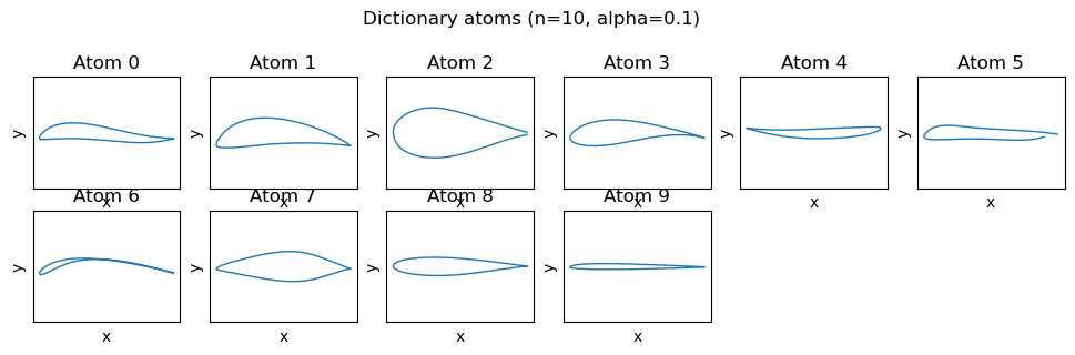
Dictionary learning finds a set of atoms (basis elements) and sparse codes that reconstruct the data. This is useful when localized, part-based representations are desirable. Essentially, unlike Sparse PCA (which adds an L1 penalty to the components), dictionary learning adds an L1 penalty to the codes. Below we fit a Dictionary Learning model and visualize a small set of learned atoms and their effect on reconstructing an example airfoil. A word on cost: the scikit-learn implementation is very slow on this data and running it to full convergence it needs about 400 alternating updates and 4 to 8 minutes. So we’ll cap the solver at 30 iterations with a looser tolerance so that it finishes in about half a minute.
Mathematically, Dictionary learning (sparse coding) models X as the product of a dictionary \(W \in \mathbb{R}^{k \times d}\) (atoms) and sparse codes \(Z \in \mathbb{R}^{n \times k}\):
\[
\min_{Z,W}\;\|X - Z W\|_{F}^{2} + \alpha\|Z\|_{1} \,\quad\text{s.t. }\|W_{j}\|_{2}\le 1\; \forall j.
\]
Here Z contains the sparse coefficients for each example and \(\alpha>0\) controls the sparsity of the codes. The constraint on \(W\) prevents trivial scaling to reduce the penalty term (i.e., just pulling weight into W and shrinking Z). Intuitively, each data point is reconstructed as a sparse linear combination of dictionary atoms, essentially selecting a few “parts” (where the parts are elements of \(W\)) to compose the whole as a weighted sum.
Notes:
The L1 penalty acts on the coefficients (Z) rather than \(W\) to encourage sparse usage of dictionary elements.
Many algorithms alternate between solving for Z (a LASSO-type problem) and updating W (a constrained least-squares step).
# The sklearn implementation is slow on this data: run to full convergence it takes ~400 iterations# and 4 to 8 minutes. We cap it at 30 iterations with a looser tolerance (about half a minute).from sklearn.decomposition import DictionaryLearning# Alternatively, you can use the MiniBatchDictionaryLearning which is faster, but less accurate or stable:#from sklearn.decomposition import MiniBatchDictionaryLearning as DictionaryLearning### Try changing n_components and alpha ########n_components =10alpha =0.1##########################DL = DictionaryLearning(n_components=n_components, alpha=alpha, random_state=42, max_iter=30, tol=1e-4)Z_dl = DL.fit_transform(data)W_dl = DL.components_
Code
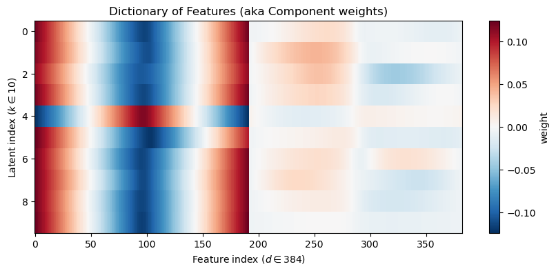
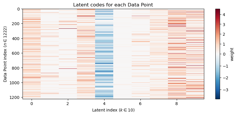
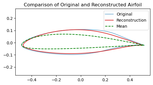
# Visualize first few atomsplt.figure(figsize=(12,6))for i inrange(n_components): plt.subplot(4,6,i+1) xy = make_airfoil(W_dl[i]) plt.plot(xy[:,0], xy[:,1], lw=1) plt.xlabel('x') plt.ylabel('y') plt.title(f'Atom {i}') plt.axis('equal') plt.xticks([]) plt.yticks([])plt.suptitle(f'Dictionary atoms (n={n_components}, alpha={alpha})')plt.show()# Component heatmapplt.figure(figsize=(10,4))plt.imshow(reorder_indices(W_dl), aspect='auto', cmap='RdBu_r', interpolation='nearest', norm=TwoSlopeNorm(vmin=W_dl.min(), vcenter=0, vmax=W_dl.max()))plt.colorbar(label='weight')plt.ylabel(f"Latent index ($k \\in {n_components}$)")plt.xlabel(f"Feature index ($d \\in {W_dl.shape[1]}$)")plt.title('Dictionary of Features (aka Component weights)')plt.show()# Latent Coordinate heatmapplt.figure(figsize=(10,4))plt.imshow(Z_dl, aspect='auto', cmap='RdBu_r', interpolation='nearest', norm=TwoSlopeNorm(vmin=Z_dl.min(), vcenter=0, vmax=Z_dl.max()))plt.colorbar(label='weight')plt.xlabel(f"Latent index ($k \\in {n_components}$)")plt.ylabel(f"Data Point index ($n \\in {Z_dl.shape[0]}$)")plt.title('Latent codes for each Data Point')plt.show()# Reconstruction an airfoil using the learned codesx_hat = np.dot(Z_dl[airfoil_id], W_dl)plt.figure(figsize=(6,3))plt.plot(make_airfoil(data[airfoil_id])[:,0], make_airfoil(data[airfoil_id])[:,1], label='Original', alpha=0.6)plt.plot(make_airfoil(x_hat)[:,0], make_airfoil(x_hat)[:,1], label='Reconstruction', color='C3')plt.plot(make_airfoil(data.mean(axis=0))[:,0], make_airfoil(data.mean(axis=0))[:,1], '--', color='g', label='Mean')plt.axis('equal')plt.title('Comparison of Original and Reconstructed Airfoil')plt.legend()plt.show()# Interactive top-k atoms displayif widgets isnotNone: top_k_slider = widgets.IntSlider(value=6, min=1, max=n_components, step=1, description='top_k')def show_top_atoms(k=6): top_idx = np.argsort(np.abs(Z_dl[airfoil_id]))[::-1][:k] plt.figure(figsize=(8,4))for i, idx inenumerate(top_idx): plt.subplot(1,k,i+1) plt.plot(make_airfoil(W_dl[idx])[:,0], make_airfoil(W_dl[idx])[:,1]) plt.axis('equal') plt.title(f'atom {idx}') plt.xticks([]) plt.yticks([]) plt.suptitle('Top atoms used for this example') plt.show() display(widgets.VBox([top_k_slider, widgets.interactive_output(show_top_atoms, {'k': top_k_slider})]))else:print('ipywidgets not available; call the top-k overlay code manually.')# Interactive top-k overlay for contributionif widgets isnotNone: top_k_slider = widgets.IntSlider(value=4, min=1, max=8, step=1, description='top_k')def show_topk(k=4): top_idx = np.argsort(np.abs(Z_dl[airfoil_id]))[::-1][:k]#contrib = np.sum(z_sp[top_idx][:,None] * W_sp[top_idx], axis=0) contrib = np.sum(Z_dl[airfoil_id,top_idx][:,None] * W_dl[top_idx], axis=0) plt.figure(figsize=(6,3)) plt.plot(make_airfoil(data[airfoil_id])[:,0], make_airfoil(data[airfoil_id])[:,1], label='Original', alpha=0.6)#plt.plot(make_airfoil(contrib + data.mean(axis=0))[:,0], make_airfoil(contrib + data.mean(axis=0))[:,1], label='Top-k contribution', color='C3') plt.plot(make_airfoil(contrib)[:,0], make_airfoil(contrib)[:,1], label='Top-k contribution', color='C3') plt.plot(make_airfoil(data.mean(axis=0))[:,0], make_airfoil(data.mean(axis=0))[:,1], '--', color='g', label='Mean') plt.axis('equal') plt.title(f'Top-{k} component contributions (overlay)') plt.legend() plt.show() display(widgets.VBox([top_k_slider, widgets.interactive_output(show_topk, {'k': top_k_slider})]))else:print('ipywidgets not available; call the top-k overlay code manually.')# Show sparsity level of codessparsity = np.mean(np.abs(Z_dl) <1e-6)print(f'Average fraction of near-zero coefficients: {sparsity:.3f}')
Average fraction of near-zero coefficients: 0.571
TipExperiment: Comparison between Dictionary Learning (Sparse Coding) and SparsePCA
Compare both the component weight matrix and the reconstruction of a single airfoil when we used Sparse PCA and Dictionary Learning (Sparse Coding).
Consider the following questions:
Both algorithms use the same sparsity penalty (L1), but on different matrices. How does this difference manifest itself in the learned components and reconstructions? What happens to the component weights versus the latent codes?
For Dictionary Learning, how does changing the value of the sparsity parameter \(\alpha\) affect the learned components and reconstruction? What happens when we increase or decrease \(\alpha\)? Look at both the weight matrix and the components.
Under what practical circumstances or for what types of problems might Dictionary Learning (Sparse Coding) be preferred over PCA and Sparse PCA, and vice versa?
4.4 Non-Negative Matrix Factorization (NMF)
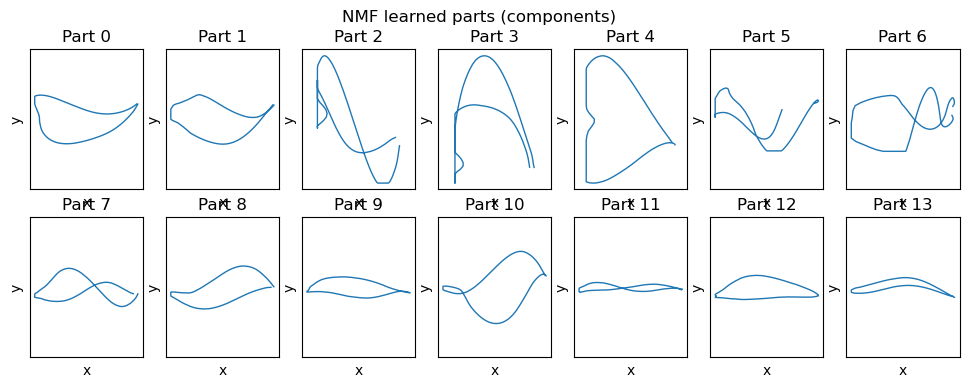
NMF constrains both the basis elements and coefficients to be non-negative. This often yields parts-based, additive representations which can be intuitive for shape components under certain circumstances.
Mathematically, Non-negative matrix factorization approximates \(X\) (with \(X > 0\) after shift) as the product of non-negative factors \(W\in \mathbb{R}^{n \times k}_{+}\) and \(H \in \mathbb{R}^{k \times d}_{+}\) by minimizing reconstruction error under non-negativity constraints:
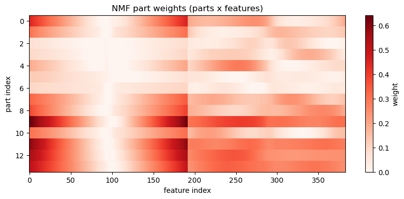
where optional L1 penalties (\(\beta_Z\), \(\beta_W \ge 0\)) encourage sparse parts or sparse activations, and L2 penalties (\(\alpha_Z\), \(\alpha_W \ge 0\)) encourage stability or shrinkage. The essential constraint is \(W,Z \ge 0\) which induces additive, parts-based representations.
Notes:
In this notebook we shift data by the minimum to ensure \(X \ge 0\) before fitting and then undo the shift when plotting reconstructions.
Typical solvers use multiplicative updates or alternating non-negative least squares; regularization (L1 or L2) can be added to encourage sparsity or stability.
from sklearn.decomposition import NMF#### Try changing n_components ########n_components =14# This is the L2 penalty on the componentsalpha_W =0.001# This is the L1 ratio on the components (between 0 and 1)# Set to 0 for pure L2, 1 for pure L1, and in between for a mixl1_ratio =0.001########################### NMF needs non-negative data. We'll shift by the min and remember the offset.shift = data.min()Xpos = data - shift +1e-6nmf = NMF(n_components=n_components, init='nndsvda', random_state=42, max_iter=5000, alpha_W = alpha_W, l1_ratio=l1_ratio)Z_nmf = nmf.fit_transform(Xpos)W_nmf = nmf.components_
Code
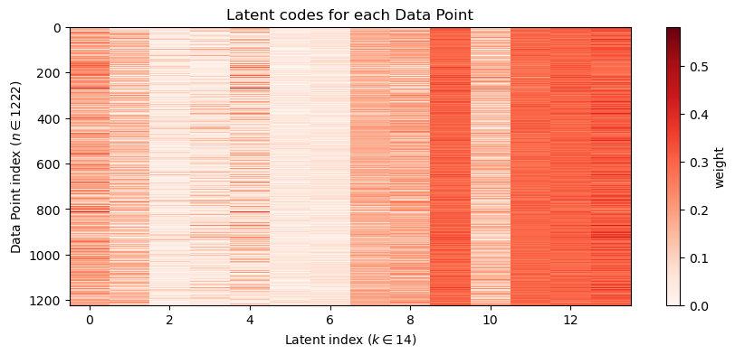
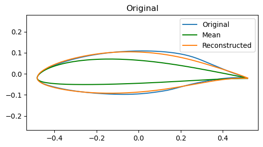
# Visualize NMF components (H) as partsplt.figure(figsize=(12,4))for i inrange(n_components): plt.subplot(2, n_components//2, i+1) xy = make_airfoil(W_nmf[i]) plt.plot(xy[:,0], xy[:,1], lw=1) plt.xlabel('x') plt.ylabel('y') plt.axis('equal') plt.title(f'Part {i}') plt.xticks([]) plt.yticks([])plt.suptitle('NMF learned parts (components)')plt.show()# Component heatmapplt.figure(figsize=(10,4))plt.imshow(reorder_indices(W_nmf), aspect='auto', cmap='Reds', interpolation='nearest')plt.colorbar(label='weight')plt.xlabel('feature index')plt.ylabel('part index')plt.title('NMF part weights (parts x features)')plt.show()# Latent Coordinate heatmapplt.figure(figsize=(10,4))plt.imshow(Z_nmf, aspect='auto', cmap='Reds', interpolation='nearest')plt.colorbar(label='weight')plt.xlabel(f"Latent index ($k \\in {Z_nmf.shape[1]}$)")plt.ylabel(f"Data Point index ($n \\in {Z_nmf.shape[0]}$)")plt.title('Latent codes for each Data Point')plt.show()# Reconstruction the airfoil using W @ Hx_hat_pos = np.dot(Z_nmf[airfoil_id], W_nmf)# undo the shift to bring back to original centered datax_hat = x_hat_pos + shift -1e-6mean_airfoil = make_airfoil(data.mean(axis=0))# Use plot_reconstruction helper for consistent display; but NMF uses shifted data so show overlay manuallyplt.figure(figsize=(6,3))#plt.subplot(1,2,1)plt.plot(make_airfoil(data[airfoil_id])[:,0], make_airfoil(data[airfoil_id])[:,1], label='Original')plt.plot(mean_airfoil[:,0], mean_airfoil[:,1], color='g', label='Mean')plt.plot(make_airfoil(x_hat)[:,0], make_airfoil(x_hat)[:,1], label='Reconstructed')plt.title('Original')plt.axis('equal')plt.legend()plt.show()# Interactive top-k partsif widgets isnotNone: top_k_slider = widgets.IntSlider(value=6, min=1, max=n_components, step=1, description='top_k')def show_top_parts(k=6): top_idx = np.argsort(Z_nmf[airfoil_id])[::-1][:k] plt.figure(figsize=(8,3))for i, idx inenumerate(top_idx): plt.subplot(1,k,i+1) plt.plot(make_airfoil(W_nmf[idx])[:,0], make_airfoil(W_nmf[idx])[:,1]) plt.axis('equal') plt.title(f'part {idx}') plt.xlim(-0.1,0.6) plt.xticks([]) plt.yticks([]) plt.suptitle('Top parts used for this example') plt.show() display(widgets.VBox([top_k_slider, widgets.interactive_output(show_top_parts, {'k': top_k_slider})]))else:print('ipywidgets not available; call the top-k overlay code manually')# Interactive top-k overlay for contributionif widgets isnotNone: top_k_slider = widgets.IntSlider(value=4, min=1, max=14, step=1, description='top_k')def show_topk(k=4): top_idx = np.argsort(np.abs(Z_nmf[airfoil_id]))[::-1][:k] contrib = np.sum(Z_nmf[airfoil_id,top_idx][:,None] * W_nmf[top_idx], axis=0) plt.figure(figsize=(6,3)) plt.plot(make_airfoil(data[airfoil_id])[:,0], make_airfoil(data[airfoil_id])[:,1], label='Original', alpha=0.6)#plt.plot(make_airfoil(contrib + data.mean(axis=0))[:,0], make_airfoil(contrib + data.mean(axis=0))[:,1], label='Top-k contribution', color='C3') plt.plot(make_airfoil(contrib+shift)[:,0], make_airfoil(contrib+shift)[:,1], label='Top-k contribution', color='C3') plt.plot(make_airfoil(data.mean(axis=0))[:,0], make_airfoil(data.mean(axis=0))[:,1], '--', color='g', label='Mean') plt.axis('equal') plt.title(f'Top-{k} component contributions (overlay)') plt.legend() plt.show() display(widgets.VBox([top_k_slider, widgets.interactive_output(show_topk, {'k': top_k_slider})]))else:print('ipywidgets not available; call the top-k overlay code manually.')print(f'Explained variance (approx): {1- np.linalg.norm(Xpos - Z_nmf.dot(W_nmf)) / np.linalg.norm(Xpos):.3f}')
Explained variance (approx): 0.994
4.5 Model Comparison
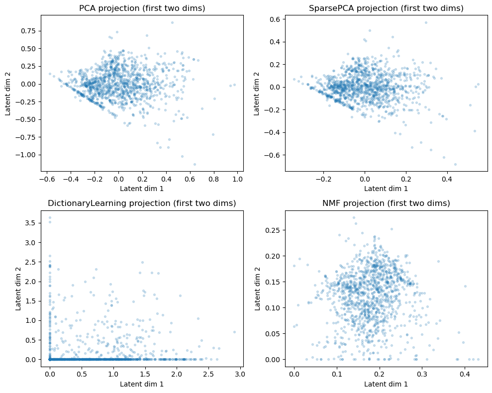
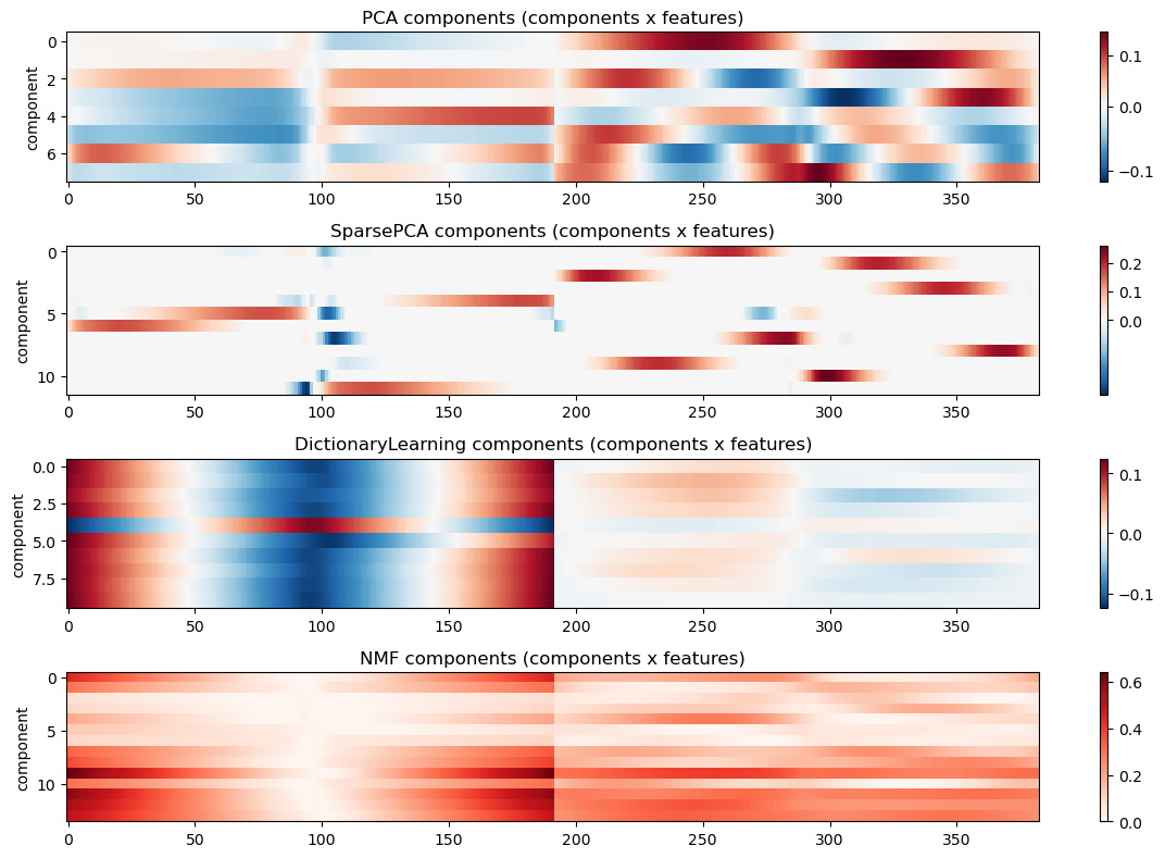
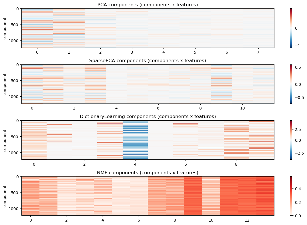
Finally, let’s compare the different models side-by-side. We will visualize the two two learned projections of the data into the latent space, as well as the component reconstruction matrix that translates those components back into the original feature space, and lastly the mapping of all data points to all latent coordinates. This is similar to plots you have seen before, but it is nice to see them all together for comparison.
Code
# Comparison: first-two latent projections and component heatmaps for each methodmodels_info = {}# PCA: the first 8 components of the 20-component fit above. PCA components are nested,# so these are exactly what an 8-component fit would return.models_info['PCA'] = {'Z': Z_pca[:, :8], 'components': components_[:8]}# SparsePCA (use Z_sp, W_sp computed earlier)models_info['SparsePCA'] = {'Z': Z_sp, 'components': W_sp}# DictionaryLearning: use W as Z and H as componentsmodels_info['DictionaryLearning'] = {'Z': Z_dl, 'components': W_dl}# NMF: use W as Z (already non-negative)models_info['NMF'] = {'Z': Z_nmf, 'components': W_nmf}# Plot the first-two latent projectionsplt.figure(figsize=(10,8))for i, (name, info) inenumerate(models_info.items()): plt.subplot(2,2,i+1) Z = info['Z'] plt.scatter(Z[:,0], Z[:,1], alpha=0.2, s=8) plt.xlabel('Latent dim 1') plt.ylabel('Latent dim 2') plt.title(f'{name} projection (first two dims)')plt.tight_layout()plt.show()# Plot heatmaps of component/weight matrices (showing first 120 features for clarity)plt.figure(figsize=(12,8))for i, (name, info) inenumerate(models_info.items()): comps = info['components']# ensure comps is (n_components, n_features)if comps.ndim ==1: comps = comps[None, :] plt.subplot(4,1,i+1)if np.any(comps <0): plt.imshow(reorder_indices(comps), aspect='auto', cmap='RdBu_r', interpolation='nearest', norm=TwoSlopeNorm(vmin=comps.min(), vcenter=0, vmax=comps.max()))else: plt.imshow(reorder_indices(comps), aspect='auto', cmap='Reds', interpolation='nearest') plt.colorbar() plt.title(f'{name} components (components x features)') plt.ylabel('component')plt.tight_layout()plt.show()# Plot heatmaps of component/weight matrices (showing first 120 features for clarity)plt.figure(figsize=(12,8))for i, (name, info) inenumerate(models_info.items()): Z_map = info['Z']# ensure comps is (n_components, n_features)if Z_map.ndim ==1: Z_map = Z_map[None, :] plt.subplot(4,1,i+1)if np.any(Z_map <0): plt.imshow(Z_map, aspect='auto', cmap='RdBu_r', interpolation='nearest', norm=TwoSlopeNorm(vmin=Z_map.min(), vcenter=0, vmax=Z_map.max()))else: plt.imshow(Z_map, aspect='auto', cmap='Reds', interpolation='nearest') plt.colorbar() plt.title(f'{name} components (components x features)') plt.ylabel('component')plt.tight_layout()plt.show()
4.6 Exercises
The exercises reuse the airfoil data and the fitted models from this chapter, so run the chapter’s cells first. estimator is the 20-component PCA; spca, DL and nmf are the Sparse PCA, Dictionary Learning and NMF fits; X_test holds the 306 held-out airfoils. Rough times are in the titles, and the last exercise is a longer take-home task.
The cell below defines three helpers: reconstruct_pca maps airfoils to their first \(k\) PCA latent coordinates and back, rms_error gives the root-mean-square (RMS) coordinate error of each airfoil, and plot_airfoil draws one airfoil.
Code
def reconstruct_pca(X, k, pca=None):"""Map the rows of X to their first k PCA latent coordinates and back (default: the chapter's estimator).""" pca = estimator if pca isNoneelse pca Z = pca.transform(X)[:, :k]return Z @ pca.components_[:k] + pca.mean_def rms_error(X, X_hat):"""Root-mean-square error over the coordinates of each airfoil (one number per row)."""return np.sqrt(np.mean((X - X_hat) **2, axis=1))def plot_airfoil(x, ax=None, **kwargs):"""Draw one flattened airfoil (length-384 vector) on the given axes.""" xy = make_airfoil(x) ax = ax if ax isnotNoneelse plt.gca() ax.plot(xy[:, 0], xy[:, 1], **kwargs) ax.set_aspect('equal')
NoteExercise 1 (~5 min): Which method has which property?
The chapter fitted four decompositions \(X \approx Z W\) to the 1222 training airfoils: PCA (components_, Z_pca), Sparse PCA (W_sp, Z_sp), Dictionary Learning (W_dl, Z_dl) and Non-negative Matrix Factorization, NMF (W_nmf, Z_nmf).
Property
PCA
Sparse PCA
Dictionary Learning
NMF
The components (rows of \(W\)) are mutually orthogonal
?
?
?
?
Many entries of \(W\) are exactly zero
?
?
?
?
Many entries of \(Z\) are exactly zero
?
?
?
?
No entry of \(W\) or \(Z\) is negative
?
?
?
?
Asking for fewer components leaves the first component unchanged
?
?
?
?
Replace each ? with yes or no, using only the objectives given in the chapter. For each yes, name the constraint or penalty that causes it and explain why.
Check the first four rows with the fitted matrices, for example with \(W W^\top\) and the fraction of entries that are exactly zero. Which predictions were wrong, and why?
Check the last row for PCA and NMF: refit each with 5 components and compare the new first component with the old one. (Refitting Sparse PCA takes about two minutes, so reason about it and Dictionary Learning from their objectives.) Why does PCA behave differently?
Code
# You can use this code cell for this exercise, if you like.
NoteExercise 2 (~5 min): PCA by hand
The chapter said that the principal components are the top right singular vectors of the centered data matrix. Check this yourself.
Subtract the mean airfoil from X_train, compute the singular value decomposition \(X = U S V^\top\) with np.linalg.svd, and compare the first 20 rows of \(V^\top\) with estimator.components_. How do they agree, and why can two correct PCA implementations differ in this way?
Compute the explained variance ratio of each component from the singular values and compare it with estimator.explained_variance_ratio_. Why does the variance along a component depend on the square of its singular value?
Code
# You can use this code cell for this exercise, if you like.
In the next exercise the held-out airfoils come back from a scanner that adds noise to every coordinate. The cell below simulates the scans. It also fits a PCA with 100 components, because the chapter’s estimator has only 20. You can change noise_level and re-run this cell and the figure cell after it.
Code
noise_level =0.003# standard deviation of the scanner noise, in chord lengths (0.6 mm on a 20 cm chord)rng = np.random.default_rng(0)X_scanned = X_test + noise_level * rng.standard_normal(X_test.shape)pca_100 = decomposition.PCA(n_components=100, svd_solver='full').fit(X_train)
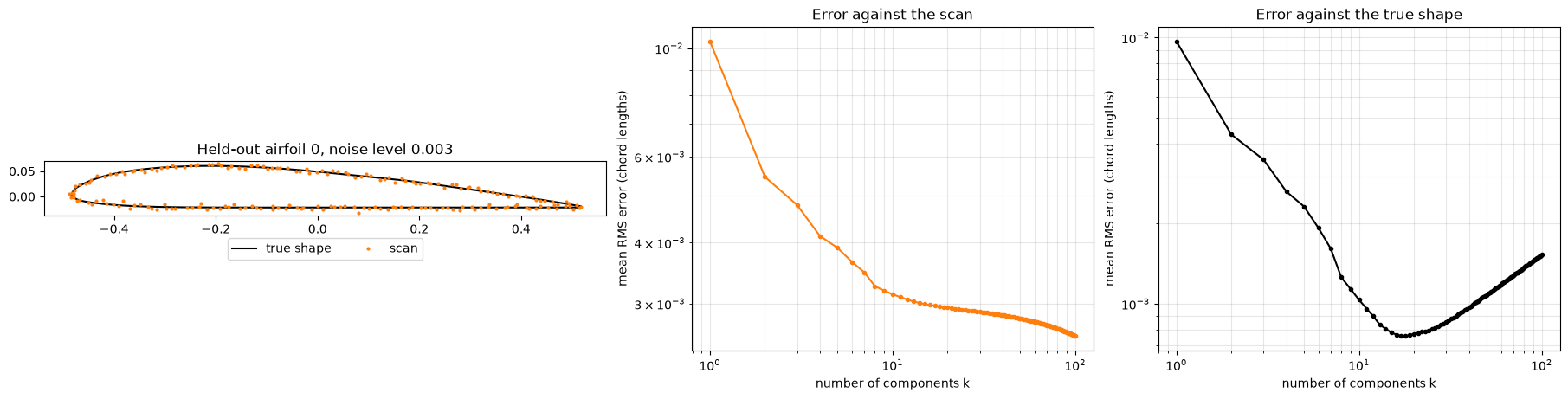
Run the cell below to produce the figure for Exercise 3. The left panel shows one scan and the true shape. The other two panels project every scan onto the first \(k\) components of pca_100 and back, for \(k\) from 1 to 100, and plot the mean RMS error against the scan (middle) and against the true shape (right). Both axes are logarithmic.
NoteExercise 3 (~6 min): Cleaning up a noisy scan
Each scanned coordinate is \(\tilde{x}_i = x_i + \varepsilon_i\). The noise \(\varepsilon_i\) is drawn independently for each coordinate from a normal distribution with density \(p(\varepsilon_i) = \frac{1}{\sqrt{2\pi}\,\sigma} \exp\left(-\frac{\varepsilon_i^2}{2\sigma^2}\right)\), where \(\sigma\) = noise_level. Projecting a scan onto a few principal components and back gives a cleaned airfoil. How many components should we use?
Why does the error against the scan keep falling as \(k\) grows, while the error against the true shape falls and then rises? What do the extra components reconstruct?
Which \(k\) would you use, and why? In practice you only have the scans, not the true shapes. Why can the middle panel not tell you the answer, and how could you choose \(k\) from the scans alone?
Set noise_level to 0.001 and then to 0.01, and re-run both cells. Which way does the best \(k\) move, and why?
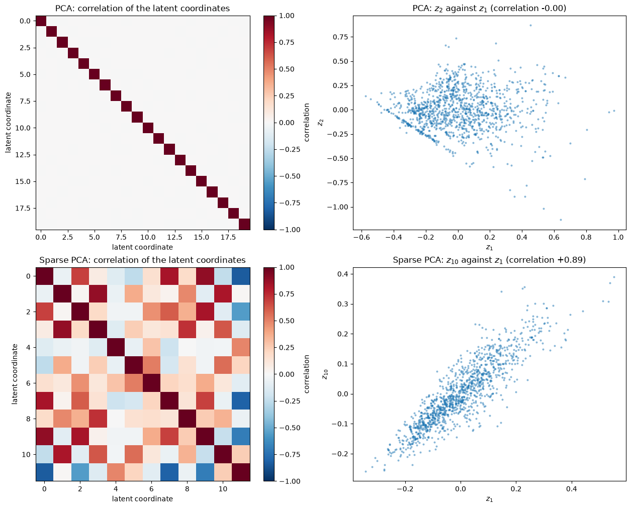
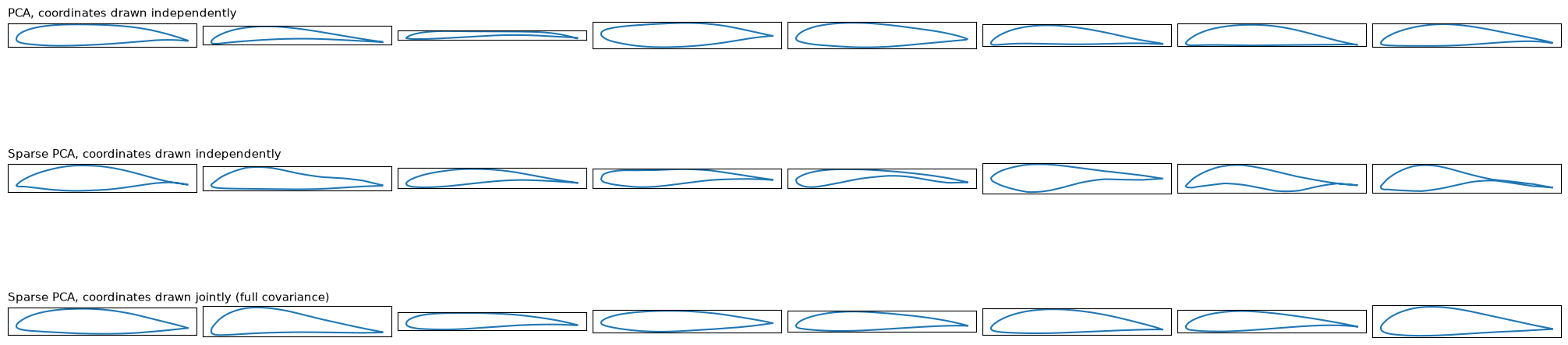
Run the cell below to produce the two figures for Exercise 4. The first figure shows how the latent coordinates of the training airfoils are distributed, for PCA (top) and Sparse PCA (bottom): the correlation matrix on the left and a scatter plot of one pair of coordinates on the right. The second figure draws random latent coordinates \(z\), maps them back to airfoils with \(W\), and plots the shapes. Each row draws \(z\) differently:
Row
Model
How the latent coordinates are drawn
1
PCA
each coordinate separately, from a normal distribution with that coordinate’s mean \(\mu_j\) and variance \(\sigma_j^2\) over the training airfoils
2
Sparse PCA
as in row 1
3
Sparse PCA
all coordinates together, from a multivariate normal distribution with the mean vector \(\mu\) and covariance matrix \(\Sigma\) of the training airfoils’ latent coordinates
Rows 1 and 2 use the density \(p(z) = \prod_{j} \frac{1}{\sqrt{2\pi}\,\sigma_j} \exp\left(-\frac{(z_j - \mu_j)^2}{2\sigma_j^2}\right)\), and row 3 uses \(p(z) = \frac{1}{\sqrt{(2\pi)^k \det \Sigma}} \exp\left(-\frac{1}{2}(z - \mu)^\top \Sigma^{-1} (z - \mu)\right)\), where \(k\) is the number of components.
NoteExercise 4 (~6 min): How are the latent coordinates distributed?
Each fitted airfoil is a point \(z\) in the latent space. If we knew how these points are distributed, we could sample new points and get new airfoils. The figures above try the simplest options.
The PCA correlation matrix is diagonal and the Sparse PCA one is not. Why does the PCA objective make the latent coordinates uncorrelated, and what in the Sparse PCA objective removes that property?
Which rows contain plausible airfoils? Why does sampling the Sparse PCA coordinates independently fail when it works for PCA, and why does sampling them jointly fix it?
The PCA coordinates \(z_1\) and \(z_2\) are uncorrelated, but their scatter plot has a sharp straight edge on one side. Are they independent? Which training airfoils lie along that edge (you can look some up), and what does a normal distribution do there that the data does not? What does this mean for using a linear decomposition with a normal distribution to generate new designs?
Code
# You can use this code cell for this exercise, if you like.
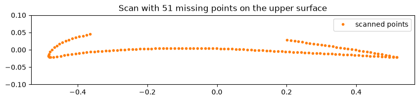
The last exercise uses a scan with a gap. The cell below takes one held-out airfoil and hides 51 consecutive points on its upper surface, as if a clamp covered that part during the scan. The scanner returns the other 141 points.
Code
inpaint_id =3# which held-out airfoil was scannedmissing_points = np.arange(30, 81) # the 51 points (out of 192) the clamp coveredobserved_points = np.setdiff1d(np.arange(192), missing_points)airfoil_true = X_test[inpaint_id]observed_xy = make_airfoil(airfoil_true)[observed_points] # what the scanner returned, 141 x 2plt.figure(figsize=(10, 3))plt.plot(observed_xy[:, 0], observed_xy[:, 1], '.', color='C1', label='scanned points')plt.gca().set_aspect('equal')plt.ylim(-0.1, 0.1)plt.legend()plt.title("Scan with 51 missing points on the upper surface")plt.show()
NoteExercise 5 (~12 min): Filling in a gap in a scan
The chapter’s PCA basis was fitted on complete airfoils, so it describes how the points of an airfoil move together. We can use it to fill in the gap. Write a function inpaint(observed_xy, observed_points, k) that finds the \(k\) latent coordinates whose reconstruction best fits the observed points in the least-squares sense, and returns the full airfoil with all 192 points. This is a linear regression like those in the first chapter, with one equation per observed coordinate. Use \(k = 10\). This is a longer take-home exercise.
Plot your reconstruction with the scanned points and the true airfoil (airfoil_true), and compute the RMS error over the missing points. Why can ten numbers fitted to the points around the gap predict where the 51 missing points are?
Now hide the whole lower surface instead (points 97 to 191) and repeat. You still have almost half of the airfoil, but the result is much worse. Why?
Your function returns one airfoil. Is it the only airfoil that fits the scanned points? If you had to decide whether the hidden part is within its manufacturing tolerance, what would you want the model to return instead, and why?
Code
# You can use this code cell for this exercise, if you like.